We gonna use dplyr, gapminder, RColorBrewer, ggplot2 libraries in this example.
Let’s load gapminder data frame and see colnames.
data("gapminder")
colnames(gapminder)
## [1] "country" "continent" "year" "lifeExp" "pop" "gdpPercap"gapminder is a data frame with 9 variables and more than 10 thousand observations. In variables we have country names, continent, year, life expectancy, population and gross domestic product per capita.
gapminder %>% head()## # A tibble: 6 x 6
## country continent year lifeExp pop gdpPercap
## <fct> <fct> <int> <dbl> <int> <dbl>
## 1 Afghanistan Asia 1952 28.8 8425333 779.
## 2 Afghanistan Asia 1957 30.3 9240934 821.
## 3 Afghanistan Asia 1962 32.0 10267083 853.
## 4 Afghanistan Asia 1967 34.0 11537966 836.
## 5 Afghanistan Asia 1972 36.1 13079460 740.
## 6 Afghanistan Asia 1977 38.4 14880372 786.Explore Data
glimpse(gapminder)## Rows: 1,704
## Columns: 6
## $ country <fct> Afghanistan, Afghanistan, Afghanistan, Afghanistan, Afghanis~
## $ continent <fct> Asia, Asia, Asia, Asia, Asia, Asia, Asia, Asia, Asia, Asia, ~
## $ year <int> 1952, 1957, 1962, 1967, 1972, 1977, 1982, 1987, 1992, 1997, ~
## $ lifeExp <dbl> 28.801, 30.332, 31.997, 34.020, 36.088, 38.438, 39.854, 40.8~
## $ pop <int> 8425333, 9240934, 10267083, 11537966, 13079460, 14880372, 12~
## $ gdpPercap <dbl> 779.4453, 820.8530, 853.1007, 836.1971, 739.9811, 786.1134, ~Mutate and Filter
For this example we gonna create a new variable called promedio global and our year of analysis will be 2007. Also, let’s take a portion of countries to visualize much better the graphics.
datos<- gapminder %>% filter(year=="2007" ) %>% arrange((lifeExp)) %>% mutate(promedio_global= mean(lifeExp))

datos2007<- datos[40:50,]
ggplot2 + Themes
There are some functions that we can add through our plots . In order to make them more informative:
brewer.pal: makes the color palettes from ColorBrewer available as R palettes. Source 1
Themes: Themes are a powerful way to customize the non-data components of your plots: i.e. titles, labels, fonts, background, gridlines, and legends. Source 2
geom_point: The point geom is used to create scatterplots. Source 3
geom_text: Adds only text to the plot Source 4
geom_segment: Draws a straight line between points (x, y) and (xend, yend). Source 5
geom_vline: This geom allows you to annotate the plot with vertical lines. Source 6
Examples
# Add a geom_segment() layer
palette <- brewer.pal(5, "RdYlBu")[-(2:4)]
plt_country_vs_lifeExp<-ggplot(datos2007, aes(x = lifeExp, y = country, color = lifeExp)) +
  geom_point(size = 4) +
  geom_segment(aes(xend = 30, yend = country), size = 2) +
  geom_text(aes(label = lifeExp), color = "white", size = 1.5) +  scale_x_continuous("", expand = c(0,0), limits = c(30,90), position = "top") +
  scale_color_gradientn(colors = palette) + labs(title="Highest and lowest life expectancies, 2007", caption="Source: gapminder")

plt_country_vs_lifeExp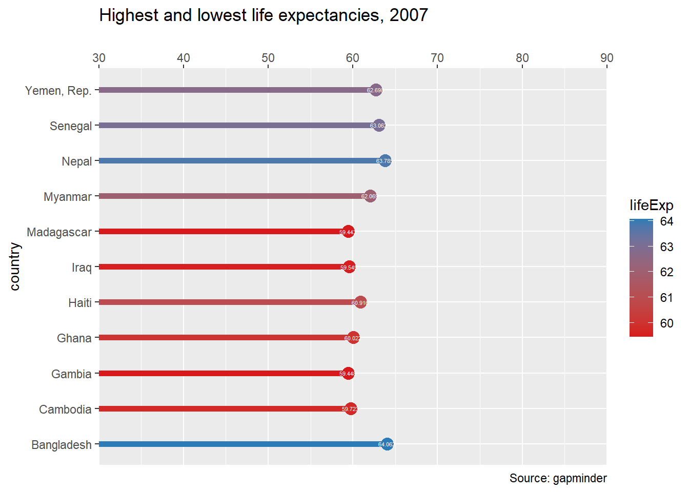
## More adds
#Define the theme
plt_country_vs_lifeExp +
  theme_classic() +
  theme(axis.line.y = element_blank(),
        axis.ticks.y = element_blank(),
        axis.text = element_text(color="black"),
        axis.title = element_blank(),
        legend.position= "none")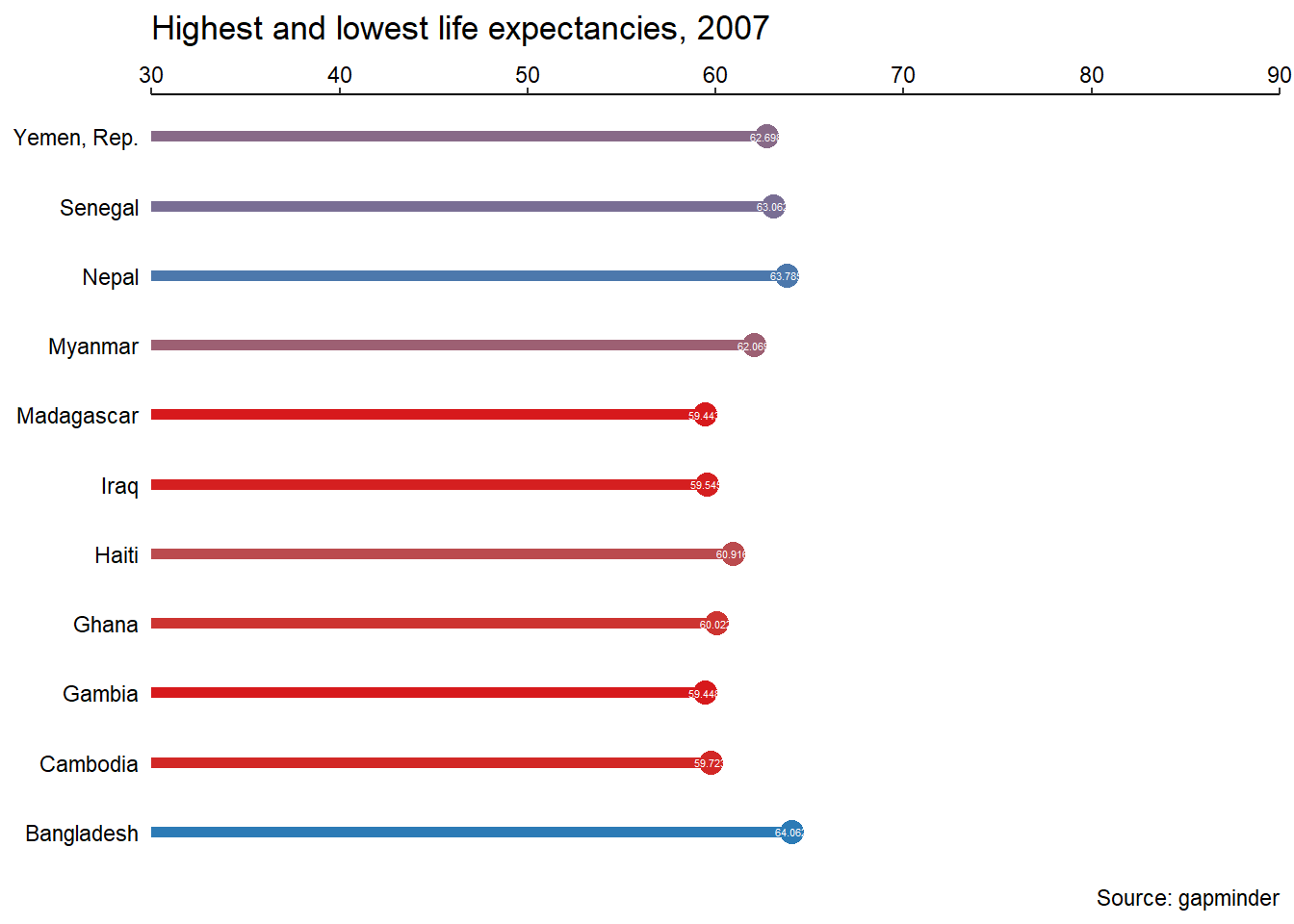
# Add a theme
step_1_themes <-theme(axis.line.y = element_blank(),
      axis.ticks.y = element_blank(),
      axis.text = element_text(color="black"),
      axis.title = element_blank(),
      legend.position= "none")

global_mean<- mean(datos2007$lifeExp)
x_start <- global_mean + 4
y_start <- 5.5
x_end <- global_mean
y_end <- 7.5

plt_country_vs_lifeExp +
  step_1_themes +
  geom_vline(xintercept= global_mean, color="grey40", linetype=3) +
  annotate(
    "text",
    x = x_start, y = y_start,
    label = "The\nglobal\naverage",
    vjust = 1, size = 3, color = "grey40")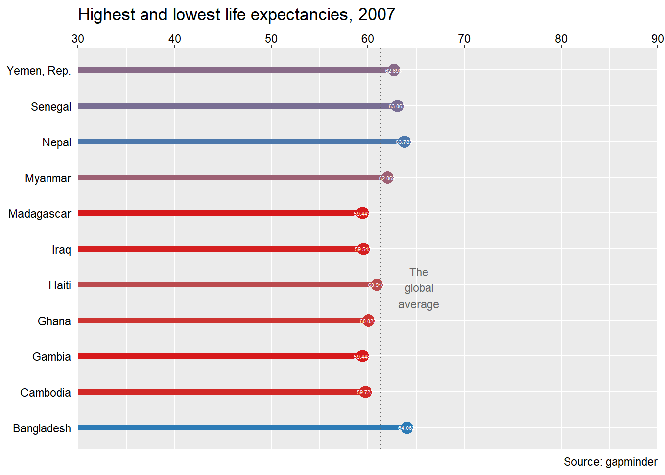
#asignamos a annotate a una variable para rebajar el codigo
step_3_annotation <- annotate(
  "text",
  x = x_start, y = y_start,
  label = "The\nglobal\naverage",
  vjust = 1, size = 3, color = "grey40")

#Grafico final
plt_country_vs_lifeExp +
  step_1_themes +
  geom_vline(xintercept = global_mean, color = "grey40", linetype = 3) +
  step_3_annotation +
  annotate(
    "curve",
    x = x_start, y = y_start,
    xend = x_end, yend = y_end,
    arrow = arrow(length= unit(0.2, "cm"), type = "closed"),
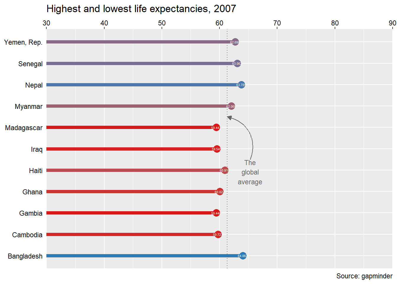
    color = "grey40")